Dark Theme in Angular
I wrote a very simple blog post mostly for myself. Everytime I implement dark theme and forgot aftewards :P Here is simple but practical step-by-step guide on implementing light and dark themes in an Angular application.
Tasnim
12/1/20233 min read
Introduction
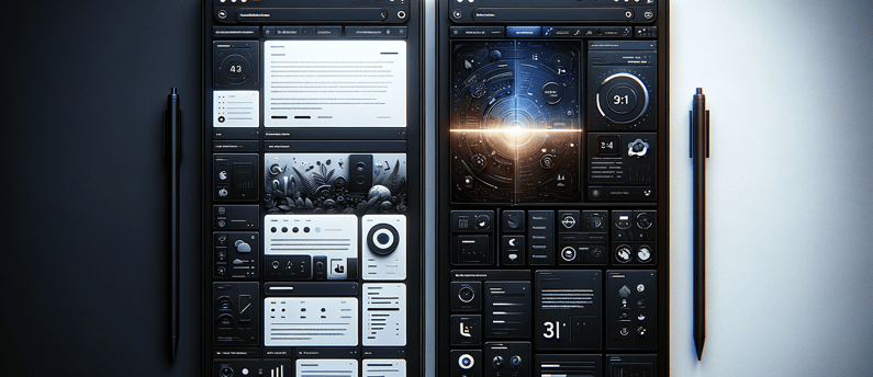
In the recent web development, the ability to switch between light and dark themes has become a standard feature, especially for enhancing user experience and accessibility. If you remember Apple celebrate their dark theme in one of their WWDC event.
I'm fan of angular from the beginning of AngularJS. It felt very natural for me after trying out different frameworks Ember, KnockoutJS and mighty jQuery. I still love jQuery; it is a fantastic library.
All right, so we're going to see how to implement the mighty DARK theme in Angular.
Step 1: Setting Up the Angular Project (optional)
First, ensure you have Angular CLI installed. If not, install it using npm install -g @angular/cli. Then, create a new Angular project with ng new your-project-name.
Reference: Angular CLI Overview
Step 2: Creating the Theme Styles
In your project create three scss files preferably inside of a theme folder for example: theme.scss, light-theme.scss and dark-theme.scss. These are the files that should contain your customized theme definition.
The theme.scss file should contain the different theme definition, typography and theme class.
Here is a sample code for theme.scss Sorry for this weird code format, my hostinger code formater is broken. Hopefully they'll fix it soon.
<code>
@use "@angular/material" as mat;
@include mat.core();
@import "your-colors.scss";
@import "your-typography.scss";
@import "light-theme.scss";
@import "dark-theme.scss";
$your-light-theme: mat.define-light-theme(
(
color: (
primary: mat.define-palette($your-primary, 900),
accent: mat.define-palette($your-accent, 900),
warn: mat.define-palette($your-warn)
),
typography: $your-typography,
density: 0
)
);
$your-dark-theme: mat.define-dark-theme(
(
color: (
primary: mat.define-palette($your-primary, 900),
accent: mat.define-palette($your-accent, 900),
warn: mat.define-palette($your-warn)
),
typography: $your-typography,
density: 0
)
);
@include mat.all-component-typographies($your-typography);
.light-theme {
@include mat.all-component-themes($your-light-theme);
@include light-theme;
}
.dark-theme {
@include mat.all-component-colors($your-dark-theme);
@include dark-theme;
}
</code>
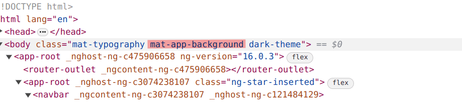
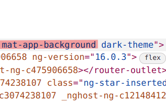
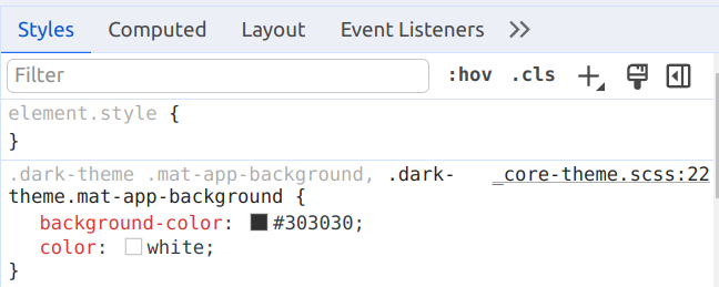
You also need to add background class. There is a predefined class from material. You need to add this to body or your top level DOM element.
This is the default dark color coming from material. If you want to change it override it in your CSS.
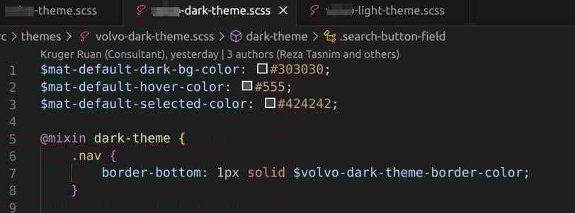
Soon you need to add color to your own component, here is an example how to add color for specific theme
At this point, you define theme and found a way to customize theme color. Now we'll learn how to toggle theme.
Step 3: Toggle theme
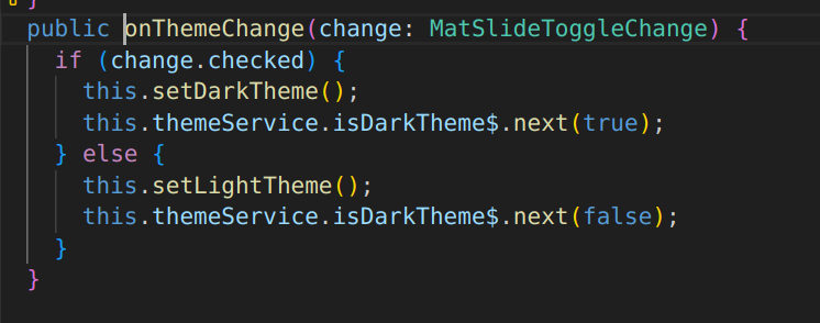
In this example I'll use LocalStorage, probably you need set the theme at user preference model. Let's we have toggle button in the UI to switch between theme.
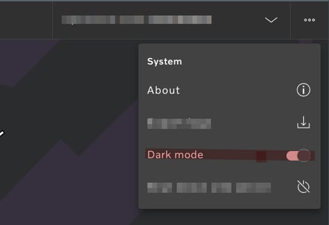
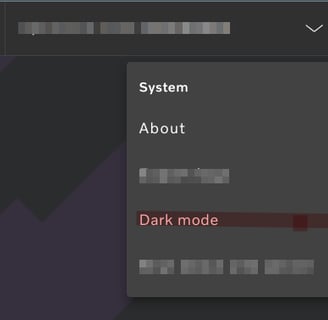
This is out sample HTML template code for menu
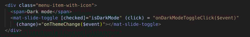
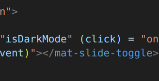
This is our menu component, where we added the toggle button change event. I created a theme service to propaget theme change throughout the app. One practical use of this theme service is to save the theme to server. To change the theme you need to add .light-theme or .dark-theme css class. This class you can add by ngClass.
Conclusion
In this simple example I tried to explain how you can add dark theme in you Angular app and how you'll switch between them. Happy coding! 🚀🌗